TrichoLab Hair & Scalp Specialist · Singapore

Design Reference Brief

Pilot reference brief

A working reference document for the TrichoLab redesign: what to borrow from selected sites, what to avoid, how the current Shopify work should be beaten, and how interactions should feel.

00

Brand guardrails

How to use this: do not send "sites I like." Steal the element, not the site. For every reference, name the specific element, why it works, and for interactions, the animation, controls, and timing feel. Negative references count as much as positive ones.

  • Headings EB Garamond, body Inter. Favour references that pair a serif display with a clean sans.
  • Antique White #f3eada, never pure #ffffff. Earth palette: sage #8a9065, cypress #545a3d, shiitake #796856, stucco #a49382, jet #212322.
  • Calm, clinical, botanical, premium. Not neon-startup, not loud DTC.
  • Mobile-first. Flag references that only shine on desktop.
A

North-star sites

North-star 1: Wimpole

wimpole.com/beard-transplant-surgery-uk

What it nails

  1. Journey-led proof. Use the "Will's beard transplant journey" pattern as a structural reference: before/after is not enough by itself; the stronger move is a named customer story with progress photos, final-result angles, short context, and a clear treatment pathway.
  2. Proof is distributed, not quarantined. Wimpole keeps trust signals moving through the page: rating callouts, review snippets, result modules, and CTAs. For TrichoLab, adapt this as editorial proof blocks with Book now and WhatsApp us actions, not loud promo banners.
  3. Process timeline. The step-by-step treatment flow is a useful model for mobile: scalp analysis → wash/prep → treatment → complementary therapy/follow-up. It makes a clinical service feel tangible without becoming a product PDP.

What to avoid

  1. Busy hero composition. Do not copy the top-form hero, tight customer close-up without context, or stacked translucent claims like "1-day procedure" / "natural look". The competing overlays and similar colour weights make the eye unsure where to land.
  2. Mobile text walls. Keep the proof/process patterns, but break long education copy into tabs, accordions, cards, and pull quotes so mobile never feels like a medical article.

On-brand fit: Strong for proof architecture and journey storytelling; weak for visual styling. Translate the structure into Antique White, sage/cypress, EB Garamond, restrained spacing, and calmer CTA treatment.

North-star 2: Fortes Clinic

fortesclinic.co.uk/treatments/prp-hair-treatment

What it nails

  1. Readable persuasion. Hair-loss treatments need more proof and explanation than a typical spa or beauty service because customers are looking for concrete, believable outcomes before committing. Fortes breaks dense PRP content into digestible sections instead of asking visitors to parse one long article.
  2. Education before overload. The useful reference is the way complex treatment information is sequenced into smaller claims, benefits, and FAQs. TrichoLab should keep that clarity while making the page feel more premium and less templated.

What to avoid

  1. Random section language. Fortes is readable, but the visual system feels haphazard: repeated checklist blocks, inconsistent modules, and a "whatever fits" layout rhythm. TrichoLab needs a consistent system that still varies pace.
  2. Filler procedure imagery. Avoid repeating large photos that show the same thing. Tight procedure close-ups in the hero make the service feel cheap and overly literal; use clinical/process imagery where it clarifies, not as page filler.

On-brand fit: Good as a readability benchmark only. The design language should be rebuilt from TrichoLab's calm clinical-botanical palette and stronger editorial hierarchy.

North-star 3: Hims, for products

hims.com/hair-loss/topical-finasteride

What it nails

  1. Product hero carousel. The image carousel is clean, interactive, and functional: thumbnail-style dot navigation is easier to tap than small dots and looks more polished than a standard blocky thumbnail row. Category pills are also a useful pattern for product filtering/positioning.
  2. Proof up front. Reviews and before/after evidence appear early instead of being buried. That ordering is relevant to TrichoLab's products and treatment pages, as long as the proof feels clinical and native.
  3. Consistent content blocks. "How it works", "Why you'll love it", and FAQs use a specific repeatable content system with clear heading/body hierarchy. This is the product-page benchmark for consistency without visual clutter.

What to avoid

  1. Oversized commercial CTAs. In related products, the buttons take too much real estate and attention compared with the merchandise. TrichoLab's product grid should keep buying actions clear but quieter.
  2. Black-white-accent austerity. The UI is sleek, but the colour model is too stark for TrichoLab and lacks the warm botanical/clinical tone.

On-brand fit: Strong for product UX, proof ordering, carousel controls, and modular content hierarchy; weak for palette. Translate interaction and layout quality into warm neutrals, sage/cypress accents, and softer product photography.

North-star 4: Juliette Armand, for products

juliettearmand.com/skin-care

What it nails

  1. Science as an organising visual system. The periodic-table concept is a useful reference because TrichoLab also makes scientific claims and ingredient/treatment references. A TrichoLab version could turn scalp concerns, treatment mechanisms, ingredients, or protocol steps into an elegant science-led module.
  2. Consistent brand world. The site keeps layout, colour, and type treatment disciplined across pages. The lesson is not "copy eggplant purple"; it is that colour should have a clear role and repeat predictably when the design needs emphasis.
  3. Clean product browsing. The overall product/category experience is polished without feeling overloaded, which is the right bar for TrichoLab shop pages.

What to avoid

  1. Do not let a science concept become a gimmick. If using a periodic-table or ingredient-system motif, it must explain something useful and work on mobile.
  2. Do not adopt the dominant purple visual identity; TrichoLab's equivalent should be cypress/sage, warm neutrals, fine rules, and measured contrast.

On-brand fit: Strong for disciplined product-brand system and science-led modules; translate the concept into TrichoLab's earth palette and quieter clinical tone.

B

Per-template pinpoint references

Current Shopify work is the floor to beat, not the ceiling. Captures below come from the implemented Dawn/TrichoLab theme so designers can compare against the real current Shopify direction.

1. Home - Gate 1 direction-setter

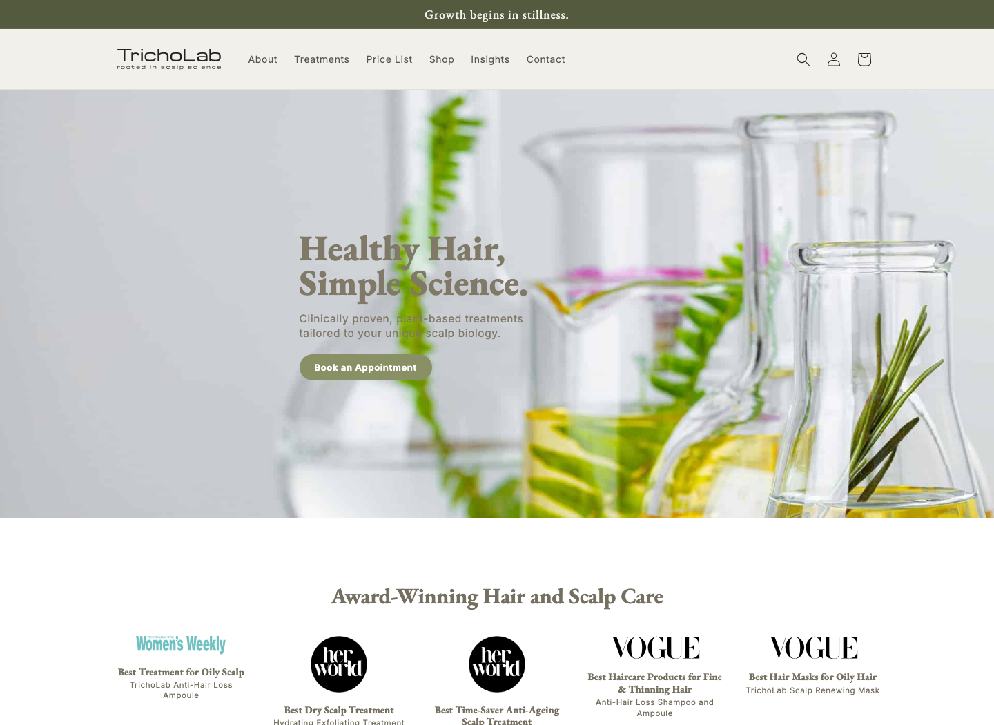
Current Shopify home hero and awards strip
Current Shopify home hero and awards strip.
  • Hero: Like the full-width science/botanical hero image with left-aligned copy, restrained CTA, top announcement bar, and award strip immediately after. Avoid the current image feeling too generic/stock-lab; improve art direction, crop, and headline scale.
  • Type hierarchy: EB Garamond headlines paired with Inter navigation/body works. Push contrast between editorial headings, dense proof copy, and form labels.
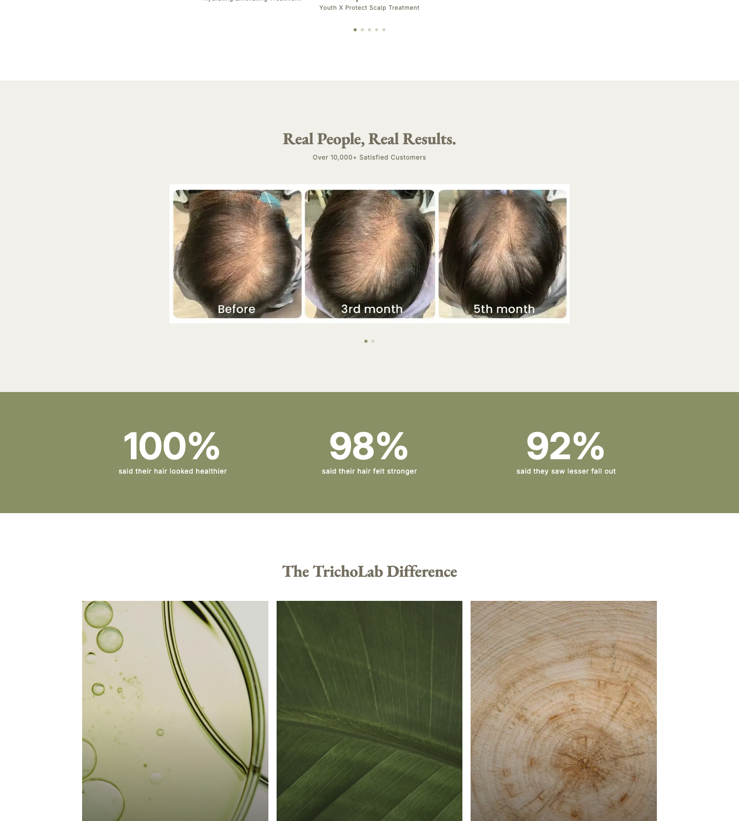
  • Proof teaser: Proof should sit high: awards immediately after hero, before/after result teaser, outcome stats, then compact review cards. Do not duplicate the eventual results page on home.
Current Shopify proof, stats, difference, and treatment cards
Current Shopify proof, stat strip, brand pillars, and signature-treatment showcase.
  • Section rhythm: Alternating Antique White/off-white and sage bands give breathing room, but the rhythm can become too even. Introduce deliberate asymmetry without becoming random.
  • Signature-treatment showcase: The three image-first service cards are clear, but basic. Make one signature treatment feel more flagship while retaining a scannable grid.
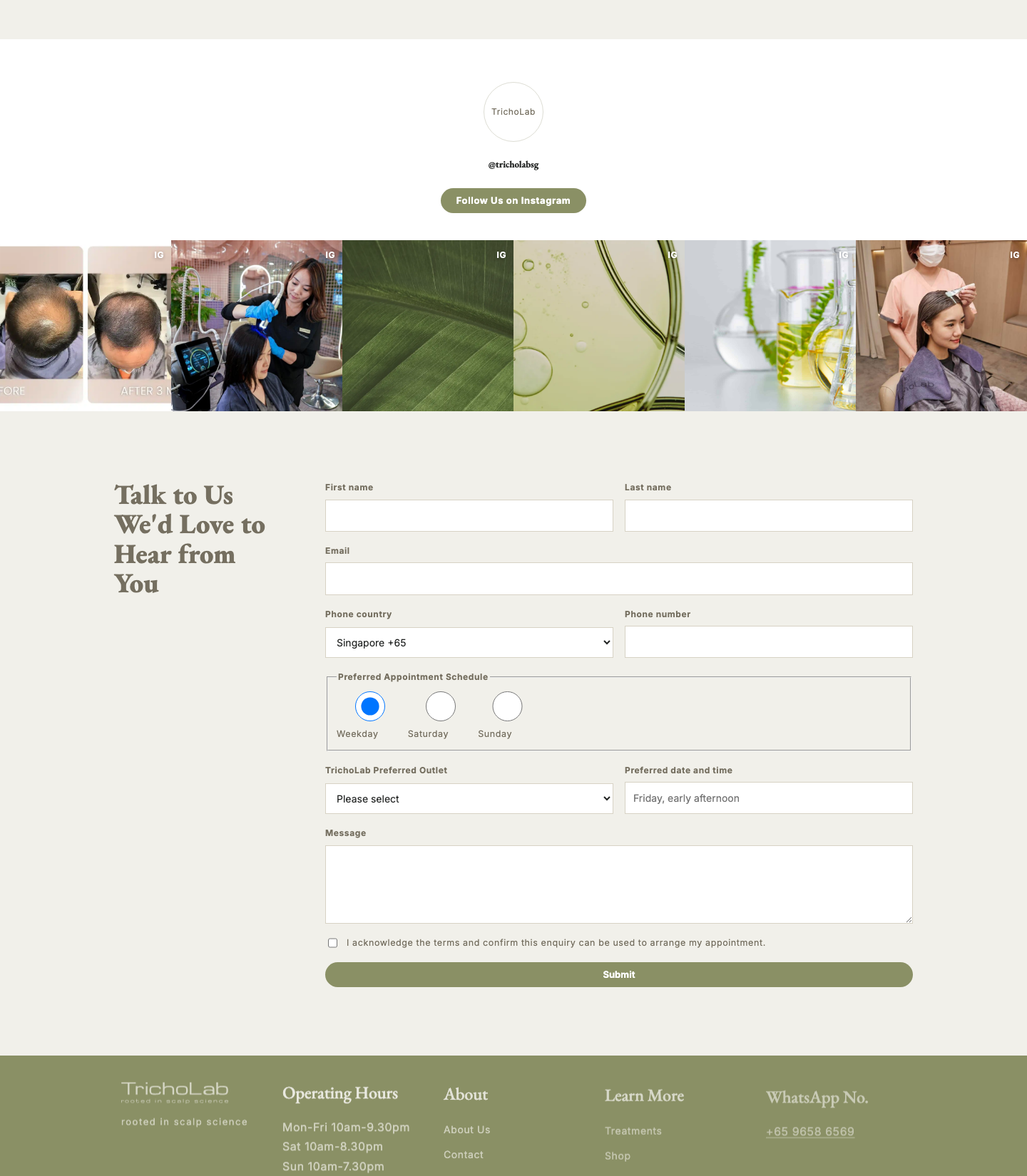
Current Shopify Instagram, booking form, and footer
Current Shopify Instagram strip, booking form, and footer.
  • Booking CTA: Booking appears as hero CTA, boutique CTA, and full contact form near the bottom. Explore a low-friction sticky mobile booking bar or persistent header CTA without making the site feel salesy.
  • Footer: Keep a content-rich footer with logo/tagline, hours, navigation, WhatsApp, social icons, and newsletter.
Current Shopify mobile top of page
Current Shopify mobile top rhythm.

Mobile instruction: Mobile keeps the right order but needs stronger first-screen hierarchy and more deliberate CTA persistence. Design mobile first; desktop refinements must not create a hero that only works wide.

2. Treatment / service page - Gate 2 hard case

  • First-trial offer badge: Current treatment templates have a merchant-editable price callout, but it sits mid-page. Test surfacing the first-trial badge in or near the hero while keeping the tone calm and credible.
  • Proof-first ordering: The current template has benefits, before/after sliders, key benefits, process, FAQ, booking, and related treatments. Reorder so proof, benefits, and offer appear before detailed mechanism copy.
  • Persistent booking CTA: Keep the primary Book Appointment and secondary WhatsApp hierarchy. Add a sticky mobile bottom bar and/or desktop side/header CTA carrying treatment name, first-trial price, and Book/WhatsApp actions.
  • Dense content: Replace long stacked education with sticky in-page nav, desktop tabs where useful, and mobile accordions. Keep SEO-visible content and crisp height/opacity transitions.
  • Process / steps: Use photo-led steps such as scalp analysis, O3 steaming mask, microneedling with IYASHI exosomes, and blue light therapy. Numbered cards or horizontal-to-vertical timeline are both valid.
  • Service is not product: Treatment pages need facts chips, WhatsApp CTA, consultation/booking form, process imagery, before/after sliders, and related procedures. Do not reuse standard PDP structure with variants, quantity, buy-now, and product gallery as the page model.

3. Shop / collection - Gate 3 standard patterns

  • Grid + card: Use the Dawn 4-column desktop / 2-column mobile grid as safe baseline. Keep vendor/rating noise off unless it earns its place. Hover can reveal secondary image only if product photography supports it.
  • Filter / sort: Horizontal filters and sorting are right for a small product range. Style as calm chips/top bar and preserve native Shopify filtering behaviour.
  • Collection header: Add restrained editorial category/scalp-concern context where useful. Avoid oversized marketing heroes that push the product grid too low.

4. Real People, Real Results - Gate 3 interaction-heavy

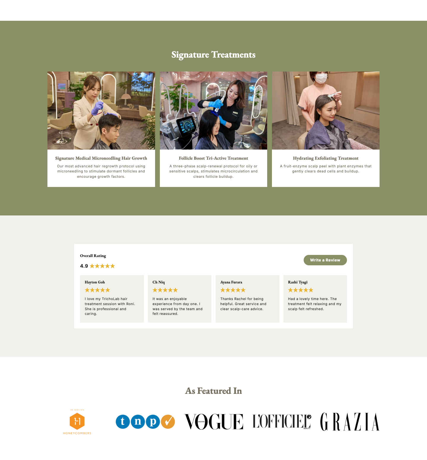
Current Shopify reviews, press, and boutique cards
Current Shopify reviews, press, and boutiques modules.
  • Before/after slider: Use a direct, snappy image wipe. The handle should track finger/mouse position; no momentum is needed.
  • Journey storytelling: Expand the home teaser pattern into full customer journeys with timeline milestones, treatment protocol, and gallery.
  • Video testimonials: Design click-to-modal video cards with still thumbnails, short quote/name/context, and deferred player load. Avoid muted autoplay by default.
  • Testimonial / quote wall: Use masonry for the deep page and slider/teaser for home. Slider drag release should snap to card boundary.
C

Interaction and component library

Mega-menu / nav

ControlDesktop hover/click/focus mega-menu grouped by concern first: Hair loss, Oily scalp, Dry scalp, Hair quality, Head spa/beauty. Mobile drawer with accordion/drill-down groups, search near top, Book/WhatsApp pinned near bottom.

MotionSticky header; menu panel fades/slides down; mobile drawer slides with horizontal submenu movement. Timing: 180-250ms, no bouncy easing.

Avoid: Flat lists of ~40 treatments and full-screen editorial nav that hides search/booking.

Logo slider

ControlArrows, dots, and drag/flick. Autoplay off by default for credibility sections; optional 5s interval for low-priority press strips.

MotionTransform slide, snap to nearest logo on release, rubber-band at edges. Timing: 300-400ms if 450ms feels sluggish.

Avoid: Continuous marquees for awards/press.

Reviews module

ControlHome uses compact aggregate score, 3-4 cards, and Write a Review CTA. Deep pages use masonry with Load more. Public source tabs, if shown, should be All / Google / Facebook only.

MotionScroll-snap card row; inline Read more; Load more appends. Hover 150ms, slider snap 250-350ms, text expansion 180ms.

Avoid: Third-party widget look, excessive star noise, and visitor-facing filter complexity.

Instagram feed

ControlHome can use shallow horizontal strip or clean 3-up row. Click opens modal by default; View on Instagram is the escape hatch.

MotionTile hover reveals subtle overlay/badges/metrics; modal fades with small scale/translate; slider uses arrows and drag/swipe, no dots.

Avoid: Loading Instagram embeds before interaction or making the feed louder than the booking form.

Tabs / accordion

ControlDesktop treatment pages may use sticky section nav or tabs for Overview / Benefits / Process / Results / FAQ. Mobile collapses to one-open-at-a-time accordions.

MotionPlus turns to minus via scale/opacity; panel opens with height/opacity where implemented. Timing: around 180ms.

Avoid: Multi-open long accordion stacks and JS-only hidden SEO-critical copy.

Global motion feel

DirectionRestrained-premium. Motion supports wayfinding and affordance only: scroll reveal, button/card hover, slider drag, modal open/close, sticky CTA show/hide.

TimingHover 120-180ms, reveal 350-500ms, modal/menu 180-250ms, sliders 250-400ms. Respect reduced motion.

Avoid: Parallax-heavy lab imagery, continuous decorative motion, bouncy easing, and large text animations.

D

Anything else

Colours and textures to lean into

  • Default page warmth should come from Antique White #f3eada, not pure white. Use warm neutrals as the base so the site feels premium, tactile, and less medical-cold.
  • Lean into sage #8a9065 and cypress #545a3d for trust, navigation, proof modules, sticky CTAs, science callouts, and treatment category wayfinding. Use botanical greens as structured accents, not a full green wash.
  • Use shiitake #796856 and stucco #a49382 for secondary panels, rules, captions, table rows, process timelines, and quieter UI states.
  • Use jet #212322 for high-contrast type and key controls. Avoid pure black unless required for legibility.
  • Texture direction: botanical/scalp-science macro textures, refined paper warmth, subtle hair/scalp diagnostic imagery, treatment-process photography, and soft lab/ingredient surfaces. Textures should support the section's meaning; no decorative blobs, neon gradients, or generic spa leaves.

Hard nevers

  • No neon-startup healthtech look, loud DTC supplement styling, sterile hospital-blue clinical templates, or beige-only spa minimalism.
  • No hero form that fights the headline, stacked promo stickers, translucent claim strips floating over faces, or offer badge that makes a treatment feel like a discounted product tile.
  • No tight procedure close-up as the first hero image unless it has strong context and premium art direction. Do not use repeated treatment photos as filler.
  • No wall-of-text mobile sections. Dense treatment education must become structured modules: proof, benefits, process, FAQs, tabs, accordions, pull quotes, or timeline cards.
  • No decorative continuous marquees for proof logos, autoplaying reels/testimonials by default, heavy parallax, bouncy easing, or motion that makes a clinical service feel gimmicky.
  • No product PDP structure for treatment pages. Treatments need proof, consultation, process, before/after, price/first-trial offer, WhatsApp/booking, and FAQs; products can keep conventional commerce UI.
  • No embedded-widget look for reviews or Instagram. Social proof should feel native to TrichoLab's editorial system.

Competitors and benchmarks to beat

  • Wimpole for treatment proof and journey storytelling. Keep their proof density and process clarity, but look calmer, less crowded, and more premium on mobile.
  • Fortes Clinic for readable treatment education. Beat them on visual system, consistency, photography discipline, and avoiding repeated checklist/filler sections.
  • Hims for product-page interaction quality. Match or exceed their carousel clarity, proof ordering, and content hierarchy while feeling warmer, more clinical-botanical, and less stark.
  • Juliette Armand for disciplined product/category brand system. Reach that consistency while making the science language specifically TrichoLab rather than cosmetic-lab generic.
  • Our current Shopify implementation is the floor to beat: keep Dawn maintainability, EB Garamond/Inter pairing, proof-first intent, and native interaction patterns, but make visual art direction more flagship, less template-like, and stronger on first-screen mobile.